Three Common Composition Mistakes Made by Beginner Photographers
Composing a shot is a skill that can prove to be elusive for many photographers. Some people are born with a “photographer’s eye” while others need to gradually learn and get better at it.
But even the best can make mistakes and here are three of those common ones:
1. Not straightening the horizon
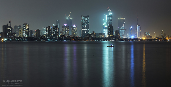
An unstraightened horizon can make your landscape shot look very casual, like shown in the shot above. Though most tripods have bubble mechanisms to precisely position your head in a way that the horizon becomes leveled, the truth is that most photographers don’t really use it.
So some amount of straightening has to be done during post-processing. You can watch this video to see how to straighten a horizon in Photoshop.
Keep in mind that straightening a shot during editing will always result in some cropping of the image. So it’s always better to get the horizon as straight as possible during shooting.
2. Using rule of thirds but giving space on the wrong end
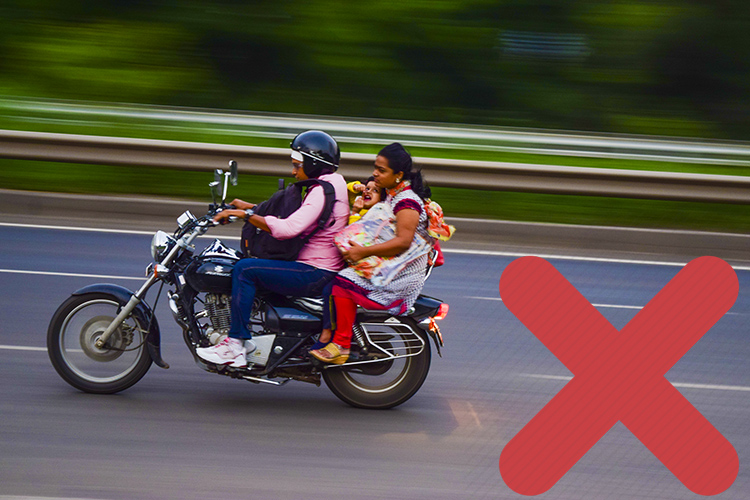
Using rule of thirds to compose your shots is a well known composition principle but even when you follow that, you have to make sure that you put the subject in the correct thirds. For instance, in the panning shot above, the composition would have been better if the bike rider was on the right side of the frame and more of the road was on the left side.
It’s always a better idea to leave negative space on the side at which the subject is looking/going. This rule is also referred to as rule of space.
3. Not getting close to the subject
There is a saying in photography -“If your shots aren’t good enough, you aren’t close enough“.
Getting close to the subject almost always looks better than shooting from far away because shooting from far away limits your opportunities to play around with angles and also results in a deeper depth of field because one of the things that depth of field depends on is the distance between the subject and the photographer. If you don’t close in, most of your shots won’t isolate the subject as the background won’t get blurred to the extent it should. On top of that, there will be unwanted distractions in the frame.
Let’s look at image below to understand this:
Here, even though I’m shooting at f2.8, the background is not isolating the the Buddha idol very well. That’s because I’m not close to the subject. There are unwanted distractions too, like the helmet in the background and the inessential parts of the table.
Now let’s look at the same shot when I go closer:
You can see that this instantly makes the shot much more artistic and impact-full. Even though I have used the same f-stop number as the last shot, the background has blurred more since I’m closer to the subject. And the unnecessary distractions are not there.
You don’t always have to go physically close to the subject. If you are using a zoom lens, you can always zoom in to your subject.
This principle of going close is often referred to as filling the frame with the subject.
Paying attention to composition can take a bit of effort and thinking but the reward is a picture that really grabs the attention of the viewer.

